I really like glass – it’s just so clean & elegant. The only thing I don’t like is the default “color” – it comes out way too blue. I know the hue is subtle, but it just clashes with everything else on the desktop.
My recommendation is to use “Frost” with transparency bumped all the way down. It’s much better. 🙂
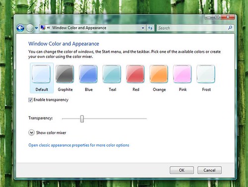
default glass

frost glass with low transparency
Cool.
Another guy who likes the frost theme this way.
I used it by default since the very first day with Vista Ultimate.
Sincerely i think too it’s the best neutral color scheme for any desktop picture you have.
For desktop image i prefer “green” photos with meadows in general or grass.
The leaves let the applicatio bar transparency to result more evident.
Ahh, the vista glass interface. It is beautiful, but man… I turned it all back to the regular old win 2000 interface. I needed that 40 megs of ram for other things 🙂
Crysis – still only getting 20FPS though & VS2008 seems to go really slow when the DotNetNuke source project is open.
Just curious, I wonder if the amount of ram used by the interface differs if your resolution is 1920×1280 or something smaller like 1280×1024.
Also curious, VS2008… when opening large projects, wonder if there are a few options that can be changed to speed up the responsiveness on some pentium 4’s. I really notice a difference running it on XP & a P4 3.2Ghz w/ 2gigs RAM V.S. Vista and just a slightly better Pentium D 2.8Ghz w/2gigs of similar speed RAM.
Thanks for the great post!
John