In Silverlight 2, we’ve added significant new support for managing states and transitions inside of controls. To help explain the Parts & States Model, I’ve put together a 4 part post series that will show how to:
- Create a control contract using the Parts & States Model
- Wire the control logic to manipulate states & parts
- Design a control template with states & parts
Playing a starring role in this content will be VisualStateManager, or as we lovingly call it, VSM. VSM can be used with both UserControls and custom controls… but in this series, we’ll concentrate on its usage with the latter.
Today’s post introduces the Parts & States model at a conceptual level.
(Note: these posts assume that you have a basic understanding of UserControls, custom controls & control templates. If you’re just starting out, check out my Mix08 controls session or my TechEd controls overview session.)
Let’s get started!
Note: this tutorial has been updated for Silverlight 2 RTW.
(Series Link: Part 1, Part 2, Part 3, Part 4)
Motivation for the Parts & States Model
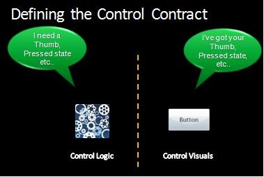
Custom controls are a type of Silverlight controls that have a strict separation between the control logic & control visuals. This is great for scenarios where you want to customize the visuals without affecting the logic, and vis versa.
While this strict separation has many benefits, it is often challenging for designers to know what elements in the template the control needs. What is missing is an explicit control contract.
If the control author provides an explicit control contract, the designer has a bill of materials for the control template. This enables easier skinning of controls.
Conceptually: Parts & States Model
The Parts & States model is a way of providing that control contract.
It is the recommended way to structure your Silverlight 2 controls. However, this pattern is not enforced by the runtime. You are free to build functioning controls that do not use the Parts & States Model.
That being said, not only do we do think the Parts & States Model is a good model – it is the model that Expression Blend supports. Therefore, if you want your control to be skinnable in Blend, you should build your control using the Parts & States paradigm.
At the highest level, there are four main concepts in the Parts & States Model:
- Parts
- States
- Transitions (between States)
- State Groups
Parts
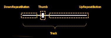
Parts are named elements inside of a control template. The control logic expects these parts to appear in the template because it needs to manipulate them in some way.
In the above slider example, there are 4 parts. Each will be programmatically accessed by the control code. When the UpRepeatButton is pressed, the control code moves the Thumb along the Track to the right. When the DownRepeatButton is pressed, the control code moves the Thumb in the opposite direction.
Not all controls need to programmatically manipulate elements in this way. Such controls (e.g. Button) will not have any Parts in their control contract.
States
Visual states represent the way the control looks in a particular logical state.
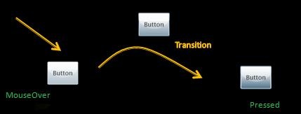
For instance, the Button above has a light background when in the MouseOver state, and a dark background when in the Pressed state.
Transitions
Visual transitions represent the way the control looks as it transitions from one visual state to another.
Above, Button’s background gradually fades from a light color to a darker color as it transitions from the MouseOver to the Pressed state.
StateGroups
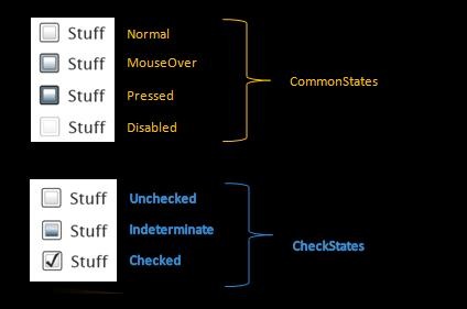
StateGroup are comprised of mutually exclusive states. State group themselves are orthogonal, meaning that a control can be in 2 different states as long as each of those states are in a different state group.
In the above CheckBox example, there are two state groups: CommonStates and CheckStates. A CheckBox can be in the MouseOver state and the Indeterminate state (for instance) because each of those states are members of a different state groups. On the other hand, it’s not possible for a CheckBox to be in the Normal and MouseOver state at the same time because they are two states in the same state group.
StateGroups are a new concept that we introduced in Beta2. They help reduce the “state explosion” that we saw in the Beta1 model. CheckBox has 7 states in Beta2 (plus 2 focus states). In Beta1, it had (AGH!) 12 states (focus was manipulates as a part and not a state).
Initiating State Changes
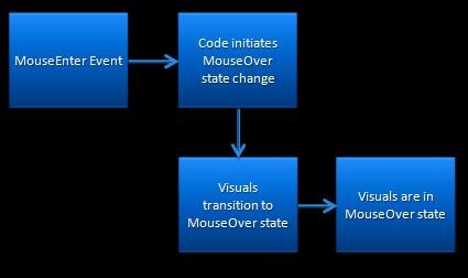
A state change starts when a control detects that, logically, it has changed state. It then initiates a visual state change, causing the appropriate visual transition and then visual state to be shown.
In the above example, for instance, a control detects a MouseEnter event. It then initiates a visual state change. The control’s visuals first show the appropriate transition and then rest in the MouseOver visual state.
Next Time
Okay, that’s the Parts & States Model at the conceptual level. In Part 2 of this series, we’ll walk through how to skin a CheckBox using the Parts & States Model.

this is a relly good post;
I really want to know how to make a custom state.
I’m looking forward to seeing your next post.
Great post Karen and well explained.
A couple of questions from a WPF developer… firstly I understand that the state model will be added to WPF in the future – does this mean we should stop using Triggers in our WPF application and use States instead if we want Blend to support skinning our apps? Will WPF’s inbuilt controls get states added to them?
Secondly, WPF already has the Parts model and it’s recommended by Microsoft to prefix all Parts with the PART_ prefix. Is this still recommended in Silverlight?
Oh – how about in Part2 skinning another control, I’ve already seen lots of examples on CheckBox skinning!
Cheers!
Neil
@Neil: All great questions! I’ll dig much more into the WPF story for Parts & States Model in the final post of this series. But the short version is: Blend’s support for triggers in WPF controls is not going to change – you’ll still have the support it has today. Moving forward, we will be adding VSM to WPF as well, which means that you’ll be able to more easily move SL templates to WPF controls. At that point, you’ll also have the parts & states Blend experience for WPF too.
The naming convention in Silverlight is slightly different – we are not using the underscore PART_ convention.
Thanks for the skin recommendation – CheckBox is a good control to give an intro on, since it has multiple state groups. But I promise to do a post later that goes into a more complex skin.
Thanks for the response Karen. I do really like the states model and the blend support; I remember when working with a graphic designer on a previous WPF project we (the devs) ended up doing most of the work on control state transitions cos the old WPF way of doing things wasn’t very designer friendly at all.
I’ll be looking forward to Part 2!
Very interesting, anybody looking for customization of the look and feel of application should read this because this article truly reflects what look less control means and how easy it is to create a custom look and states for a control in silverlight.
The link to part 2 isn’t working 🙁
Pingback:Pietro Brambati Blog : Silverlight 2 – (alcune) risorse
Pingback:Silverlight Bits&Pieces: The First Steps with Visual State Manager « AJ’s blog
Pingback:An Early Look – VisualStateManager for WPF | karen corby's fabulous blog
Pingback:FlickrViewr Updated for Beta2 | karen corby's fabulous blog