This is the third post in a four part series on Silverlight 2’s Parts & States control model.
Last time, you learned how to reskin an existing control using VisualStateManager. In this post, you’ll see how to build up a Parts & States-based custom control. We’ll also explore how you can create more sophisticated visual transitions.
(Series Link: Part 1, Part 2, Part 3, Part 4)
VisualStateManager
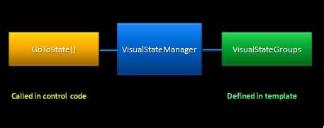
We’ve saw it briefly in the last post, but let’s formally introduce VisualStateManager. ![]()
VisualStateManager is the class responsible for control visual state management. The “visual” modifier in that sentence is important – the control logic remains in charge of the logical state machine.
VSM exposes two main pieces of PME:
- a VisualStateGroups attached property
- This property is set on the control template’s root visual and contains all the visual states & transitions for that skin
- a static GoToState() method
- This method causes VisualStateManager to transition the control’s visuals from one visual state to another.
Last time, we concentrated on the VisualStateGroups property in XAML. Today, we’ll dig into how the control code leverages that GoToState() method.
WeatherControl
The custom control that we’ll be looking at today is a simple WeatherControl. The shell of the control code can be found below. (Note: For readability, I’ve collapsed some of the code snippets. You can find the full sample code here.)
1: public class WeatherControl : Control
2: {
3:
4: public WeatherControl()
5: {
6: DefaultStyleKey = typeof(WeatherControl);
7: }
8:
9: // OnApplyTemplate()
10: public override void OnApplyTemplate()
11: {
12: base.OnApplyTemplate();
13: }
14:
15: // Temperature DP
16: public static readonly DependencyProperty TemperatureProperty = = DependencyProperty.Register("Condition", typeof(Condition), typeof(WeatherControl),null);
17: public string Temperature
18: {
19: get { ... }
20: set { ... }
21: }
22:
23: // Condition DP
24: public static readonly DependencyProperty ConditionProperty = DependencyProperty.Register("Condition", typeof(Condition), typeof(WeatherControl), new PropertyMetadata(new PropertyChangedCallback(WeatherControl.OnConditionPropertyChanged)));
25: public Condition Condition
26: {
27: get { ... }
28: set { ... }
29: }
30:
31: // ConditionDescription DP
32: public static readonly DependencyProperty ConditionDescriptionProperty = DependencyProperty.Register("ConditionDescription", typeof(string), typeof(WeatherControl), null);
33: public string ConditionDescription
34: {
35: get { ... }
36: set { ... }
37: }
38:
39: // Property change notification
40: private static void OnConditionPropertyChanged(DependencyObject d, DependencyPropertyChangedEventArgs e)
41: {
42: WeatherControl weather = d as WeatherControl;
43: ...
44: weather.OnWeatherChange(null);
45: }
46:
47: // OnWeatherChange virtual
48: protected virtual void OnWeatherChange(RoutedEventArgs e)
49: {
50: }
51:
52: }
You can see that our WeatherControl…
- is a custom control, deriving from Control.
- defines its own built-in style, as indicated by the DefaultStyleKey.
- has 3 public dependency properties:
- Temperature
- Condition
- ConditionDescription
In order to make our WeatherControl skinnable with VSM, we need to:
- define a control contract
- discover & manipulate parts
- wire up appropriate state changes using VisualStateManager
Here we go!
Defining the Control Contract
The control code is responsible for documenting the control contract. This means it should declare any and all expected Parts and States. This is done using class level metadata:
1: [TemplatePart(Name="Core", Type=typeof(FrameworkElement))]
2:
3: [TemplateVisualState(Name="Normal", GroupName="CommonStates")]
4: [TemplateVisualState(Name="MouseOver", GroupName="CommonStates")]
5: [TemplateVisualState(Name="Pressed", GroupName="CommonStates")]
6:
7: [TemplateVisualState(Name="Sunny", GroupName="WeatherStates")]
8: [TemplateVisualState(Name="PartlyCloudy", GroupName="WeatherStates")]
9: [TemplateVisualState(Name="Cloudy", GroupName="WeatherStates")]
10: [TemplateVisualState(Name="Rainy", GroupName="WeatherStates")]
11: public class WeatherControl : Control
12: {
13: ...
14: }
In the above snippet, there are two attribute classes:
- TemplatePartAttribute
- Specifies the name of the part & expected type
- TemplateVisualStateAttribute
- Specifies the name of the state & its associated state group
This metadata is not used by the runtime. However, it is leveraged by tools like Expression Blend for their skinning support.
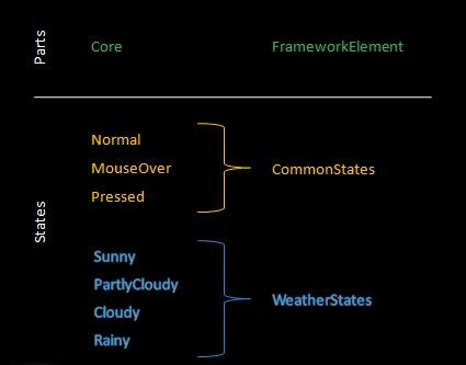
These attributes on the WeatherControl give rise to this control bill of materials:
Now, let’s see how the control code manipulates Parts.
Discovering Parts
Parts are named elements in the template and need to be manually discovered by the control code. This is done in the OnApplyTemplate() virtual, which is called whenever a new template is applied.
1: // OnApplyTemplate
2: public override void OnApplyTemplate()
3: {
4: base.OnApplyTemplate();
5:
6: CorePart = (FrameworkElement)GetTemplateChild("Core");
7: }
8:
9: // private CorePart property
10: private FrameworkElement CorePart
11: {
12: get
13: {
14: return corePart;
15: }
16:
17: set
18: {
19: FrameworkElement oldCorePart = corePart;
20:
21: if (oldCorePart != null)
22: {
23: oldCorePart.MouseEnter -= new MouseEventHandler(corePart_MouseEnter);
24: oldCorePart.MouseLeave -= new MouseEventHandler(corePart_MouseLeave);
25: oldCorePart.MouseLeftButtonDown -= new MouseButtonEventHandler(corePart_MouseLeftButtonDown);
26: oldCorePart.MouseLeftButtonUp -= new MouseButtonEventHandler(corePart_MouseLeftButtonUp);
27: }
28:
29: corePart = value;
30:
31: if (corePart != null)
32: {
33: corePart.MouseEnter += new MouseEventHandler(corePart_MouseEnter);
34: corePart.MouseLeave += new MouseEventHandler(corePart_MouseLeave);
35: corePart.MouseLeftButtonDown += new MouseButtonEventHandler(corePart_MouseLeftButtonDown);
36: corePart.MouseLeftButtonUp += new MouseButtonEventHandler(corePart_MouseLeftButtonUp);
37: }
38: }
39: }
To find a named element inside of the template, you use the GetTemplateChild() helper method.
In the above example, we discover the “Core” part, which we will use to determine when the control should go into the MouseOver or Pressed states. Note that the setter logic is resilient to the Core part not being in the template. This is important, because a control needs to be robust enough to handle a part that is missing or not yet been added.
Initiating State Changes
The control code is responsible for telling VisualStateManager when a visual state change should occur. Therefore, it must maintain the logical state machine that is associated with the visual state machine.
All of Silverlight 2’s built-in controls create a simple helper method to assist with the state changes. We recommend that you follow a similar pattern:
1: // GoToState() helper
2: private void GoToState(bool useTransitions)
3: {
4: // Go to states in NormalStates state group
5: if (isPressed)
6: {
7: VisualStateManager.GoToState(this, "Pressed", useTransitions);
8: }
9: else if (isMouseOver)
10: {
11: VisualStateManager.GoToState(this, "MouseOver", useTransitions);
12: }
13: else
14: {
15: VisualStateManager.GoToState(this, "Normal", useTransitions);
16: }
17:
18: // Go to states in WeatherStates state group
19: if (Condition == Condition.PartlyCloudy)
20: {
21: VisualStateManager.GoToState(this, "PartlyCloudy", useTransitions);
22: }
23: else if (Condition == Condition.Sunny)
24: {
25: VisualStateManager.GoToState(this, "Sunny", useTransitions);
26: }
27: else if (Condition == Condition.Cloudy)
28: {
29: VisualStateManager.GoToState(this, "Cloudy", useTransitions);
30: }
31: else
32: {
33: VisualStateManager.GoToState(this, "Rainy", useTransitions);
34: }
35: }
The GoToState helper method contains a series of if statements which determine the current visual states. It then tells VisualStateManager to initiate the appropriate state change. This is done with the static public static bool VisualStateManager.GoToState(Control control, string stateName, bool useTransitions) method.
As you can see, this method…
- has 3 parameters:
- control: instance of the control
- stateName: name of the visual state to go to
- usetTransitions: flag to determine whether transitions should be run in this state change
- returns a bool
- It returns true if the state name was found and false otherwise.
- is a no op if…
- the control was already in the passed in visual state
- the visual state cannot be found
Most control authors will call their GoToState() helper in 3 places:
- OnApplyTemplate() with no transitions.
- When the control first appears, we generally want it to just appear in the appropriate state, and not transition into it.
- In certain property change notification handlers
- In certain event handlers
For our WeatherControl, we add these calls:
1: // OnApplyTemplate
2: public override void OnApplyTemplate()
3: {
4: base.OnApplyTemplate();
5:
6: CorePart = (FrameworkElement)GetTemplateChild("Core");
7:
8: GoToState(false);
9: }
10:
11: // Property Change Notifications
12: protected virtual void OnWeatherChange(RoutedEventArgs e)
13: {
14: GoToState(true);
15: }
16:
17: // Event Handlers
18: void corePart_MouseEnter(object sender, MouseEventArgs e)
19: {
20: isMouseOver = true;
21: GoToState(true);
22: }
23:
24: void corePart_MouseLeave(object sender, MouseEventArgs e)
25: {
26: isMouseOver = false;
27: GoToState(true);
28: }
29:
30: void corePart_MouseLeftButtonDown(object sender, MouseButtonEventArgs e)
31: {
32: isPressed = true;
33: GoToState(true);
34: }
35:
36: void corePart_MouseLeftButtonUp(object sender, MouseButtonEventArgs e)
37: {
38: isPressed = false;
39: GoToState(true);
40: }
For the WeatherControl, we need to initiated state changes when:
- the template is first applied
- the Condition property is changed
- mouse events are raised from the Core part
Adding a Built-In Style
So now we have our control logic!
I’ve cooked up a very fun (if I do say so myself) ControlTemplate to show off our WeatherControl. The “fun” makes the template a bit long, however. Here’s the editted version:
1: <!-- VisualStateManager -->
2: <vsm:VisualStateManager.VisualStateGroups>
3:
4: <!-- CommonStates StateGroup-->
5: <vsm:VisualStateGroup x:Name="CommonStates">
6:
7: <!-- CommonStates States-->
8: <vsm:VisualState x:Name="Normal"/>
9: <vsm:VisualState x:Name="MouseOver"><Storyboard> ... </Storyboard></vsm:VisualState>
10: <vsm:VisualState x:Name="Pressed"><Storyboard> ... </Storyboard></vsm:VisualState>
11:
12: <!-- CommonStates Transitions-->
13: <vsm:VisualStateGroup.Transitions>
14: <vsm:VisualTransition GeneratedDuration="0:0:.6"/>
15: <vsm:VisualTransition To="Pressed" GeneratedDuration="0:0:.4"/>
16: <vsm:VisualTransition From="Pressed" GeneratedDuration="0:0:.4"/>
17: </vsm:VisualStateGroup.Transitions>
18:
19: </vsm:VisualStateGroup>
20:
21: <!-- WeatherStates StateGroup-->
22: <vsm:VisualStateGroup x:Name="WeatherStates">
23:
24: <!-- WeatherStates States-->
25: <vsm:VisualState x:Name="Sunny"/>
26: <vsm:VisualState x:Name="PartlyCloudy""><Storyboard> ... </Storyboard></vsm:VisualState>
27: <vsm:VisualState x:Name="Cloudy"><Storyboard> ... </Storyboard></vsm:VisualState>
28: <vsm:VisualState x:Name="Rainy"><Storyboard> ... </Storyboard></vsm:VisualState>
29:
30: <!-- WeatherStates Transitions-->
31: <vsm:VisualStateGroup.Transitions>
32: <vsm:VisualTransition GeneratedDuration="0:0:.3"/>
33: </vsm:VisualStateGroup.Transitions>
34:
35: </vsm:VisualStateGroup>
36:
37: </vsm:VisualStateManager.VisualStateGroups>
As you can see from this ControlTemplate, I’ve:
- defined all 7 VisualStates.
- leveraged storyboard resources to define the state storyboards
- supplied a default VisualTransition for both the CommonStates and WeatherStates
- specified VisualTransitionss for certain state changes in the CommonStates
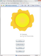
Let’s run it!
Adding Specialized Transitions
The generated transitions work well for our WeatherControl. However, being ambitious, let’s add more customized visual transitions between certain state changes.
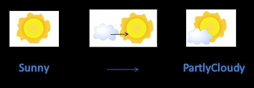
Here’s our skin in the different weather states:
When our control goes from Sunny to PartlyCloudy, we don’t want the cloud to to just gradually animate in. Instead, we’d like it to zoom from the left.
In order to create a custom transition like this, you can specify an explicit transition storyboard:
1: <!-- WeatherStates Transitions-->
2: <vsm:VisualStateGroup.Transitions>
3:
4: <!-- Sunny to PartlyCloudy Transition -->
5: <vsm:VisualTransition
6: From="Sunny" To="PartlyCloudy"
7: GeneratedDuration="0:0:.5">
8: <Storyboard Duration="0:0:.5">
9: <DoubleAnimationUsingKeyFrames
10: BeginTime="00:00:00"
11: Storyboard.TargetName="BottomCloud"
12: Storyboard.TargetProperty="(UIElement.RenderTransform).(TransformGroup.Children)[3].(TranslateTransform.X)">
13: <SplineDoubleKeyFrame KeyTime="00:00:00" Value="-150"/>
14: <SplineDoubleKeyFrame KeyTime="00:00:00.5000000" Value="0" KeySpline="0.173,0.019,1,0.484"/>
15: </DoubleAnimationUsingKeyFrames>
16: <DoubleAnimationUsingKeyFrames
17: BeginTime="00:00:00"
18: Storyboard.TargetName="BottomCloud" Storyboard.TargetProperty="(UIElement.Opacity)">
19: <SplineDoubleKeyFrame KeyTime="00:00:00" Value="0"/>
20: <SplineDoubleKeyFrame KeySpline="0.173,0.019,1,1" KeyTime="00:00:00.2000000" Value="0.1"/>
21: <SplineDoubleKeyFrame KeyTime="00:00:00.5000000" Value="1" KeySpline="0,0,1,0.484"/>
22: </DoubleAnimationUsingKeyFrames>
23: </Storyboard>
24: </vsm:VisualTransition>
25:
26: <!-- WeatherStates Default Transition -->
27: <vsm:VisualTransition Duration="0:0:.3"/>
28:
29: </vsm:VisualStateGroup.Transitions>
Now, when VisualStateManager is generating transitions animations for the Sunny to PartlyCloudy state change, it will no longer generate animation for the BottomCloud’s opacity. It will just run the explicit transition storyboard with its two double animations.
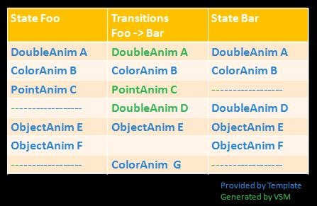
To better understand stand how generated transition animations interact with explicit transitions storyboards, let’s look at an example:
Here, we have two visual states: Foo & Bar. They each animate a different (partially overlapping) set of properties.
How do the the transition animations get built up?
- VSM will generate transition animations for properties A, C, and D.
- A, C, and D are animated in one or both of the two states, AND are not animated in the explicit VisualTransition.Storyboard storyboard.
- VSM will run the explicit transition storyboard to transition properties B, E, and G
- B, E, and G are animated by VisualTransitoin.Storyboard. VSM does not need to generate transition animations for these properties.
- VSM will not animate the transition of property F.
- F is animated with an ObjectAnimation in the Foo & Bar states. It’s not possible for VSM to programmatically generate a linear transition animation for an ObjectAnimation. Therefore, property F will simply snap into its Bar value after the transition animations have run.
Going back to our WeatherControl, I’ve also added explicit transitions for Sunny->PartlyCloudy, Sunny->Cloudy, and PartlyCloudy->Cloudy.
Run the application one last time to see our final look! You can also grab the source code here.
Next time
So that’s how to build up a Parts & States-based custom control using VisualStateManager. I hope you also enjoyed those custom explicit transitions. ![]()
Next time, in this series final post, we’ll give some general recommendations on how to use the Parts & States Model. You’ll also learn about some of our future plans for the Parts & States Model in Silverlight as well as Windows Presentation Foundation!


Hey Karen
Very informative, and I’m really looking forward to part 4! Can you build User Controls with states? I have tried adding the TemplateVisualStyle attribute to a user control and it doesn’t show up in Blend when I am editing the control’s xaml?
Cheers
Neil
@”VSM exposes two main pieces of PME:”
What does PME stand for?
also, i think you have a typo on line 16 of the first code snippet.
public static readonly DependencyProperty TemperatureProperty = = DependencyProperty.Register(“Condition”, typeof(Condition), typeof(WeatherControl),null);
should have only one equals and should be … DependencyProperty.Register(“Temperature”, … ???
also,
“In the above example, we discover the “Core” part, which we will use to determine when the control should go into the MouseOver or Pressed states. ”
The subtle assumption here is that the corePart defines the whole visual region of the control and therefore the whole visual hit test. However, just looking at the code given doesn’t tell you that much…
also, one more subtle remark: In the explicit transition animations defined by the Storyboard elements, you are implicitly storing information about the prior state:
The transition should simply represent the transition, if possible. Only store actual values from states in the transition for performance reasons, since it increases data redundancy and potential for mistakes. VisualTransition objects should only keep track of the relationships between states.
sorry for spamming your wonderful blog series, btw, with my thoughts on best practices
also, the GoToState() helper in Silverlight is named ChangeVisualState()… which makes more sense
Thanks everyone for the comments!
@Neil: yes, you can create a UserControl using states. Today, the expectation around UserControls is that the designer will be creating the states first and then passing it to the control code developers to hook up the states. Therefore, there the tools are not looking at class metadata on UserControls. I have, however, passed on your question to the Blend team.
@John:
– PME stands for “Properties, Methods, and Events”. 🙂
– I fixed the typo, thanks!
– The core part actually doesn’t necessarily need to be the whole visual portion. In fact, it’s actually just the center part of the control. (Although, it’s true… this usage of a Part is a bit contrived. Better examples of Part usage is the Thumb part of a Slider, etc. But I wanted to keep things simple in this post.)
PME == Property, Methods and Events
PME is most often used in place of API when talking about objects. Sometimes it is also refered to as OM or Object Model.
Karen,
I’ve noticed that the control does not trap the mouse movements.
For example; if you press the left mouse button, the control state changes. If you then move the mouse away from the control before releasing the left mouse button, the control is left in an invalid state.
Can this be avoided?
Cheers,
Karl
I’m not understanding the method OnConditionPropertyChanged. Can you explain it more? It doesn’t look like args are used below, but probably a deeper question is why was this callback needed in the first place?
private static void OnConditionPropertyChanged(DependencyObject d, DependencyPropertyChangedEventArgs e)
{
WeatherControl weather = d as WeatherControl;
var newValue = (Condition)e.NewValue;
RoutedEventArgs args = new RoutedEventArgs();
args.Source = weather;
weather.OnWeatherChange(null);
}
Hi Karen,
Great Tutorial- needs to be updated for SL RC0 though:
* Comment out a line in each of the Change Notification Handlers (args.Source = weather;) – which didn’t seem to be used anyway
* Change to GeneratedDuration
* Move the blocks out of and into their respective tags
works like a charm!
looks like angular brackets were stripped from my post…. i’ll try again:
* Comment out a line in each of the Change Notification Handlers (args.Source = weather;) – which didn’t seem to be used anyway
* Change vsm:VisualTransition Duration to GeneratedDuration
* Move the Storyboard blocks out of Grid.Resources and into their respective vsm:VisualState tags
Pingback:Pietro Brambati Blog : Silverlight 2 – (alcune) risorse
Pingback:Digging Into Custom Controls - Jesse Liberty - Silverlight Geek
Hi Karen,
Part 3 is also missing?
Parts 2 and 3 of this article of blank. All I see on the web site are the comments.
Can you please fix.
Thank you !! Very good discussion and it filled in some holes for me!
When I call GoToState in my custom control, and parse in ‘false’ for useTransitions, I still get my animation. It doesn’t skip to the end of the storyboard.
Am I missing some obvious setting on the visual state or storyboard?
Pingback:Digging Into Custom Controls | Блог Івана Шіхта
Pingback:Parts & States Model with VisualStateManager (Part 2 of 4) | karen corby's fabulous blog