This is the second post in a four part series about managing parts & states in Silverlight 2 controls.
Today, we’ll put into practice the concepts you learned last time and walk through how to reskin a CheckBox. (If you haven’t already, please be sure to read part 1 of this series.)
Note: I’ve shortened the XAML snippets in this post for readability. You can download the full sample code here.
(Series Link: Part 1, Part 2, Part 3, Part 4)
A CheckBox ControlTemplate
ControlTemplates define the visuals for a custom control. The CheckBox ControlTemplate that we’ll be expanding on in this post is below.

1: <ControlTemplate TargetType="CheckBox">
2: <StackPanel x:Name="Root" ...>
3:
4: <!-- OuterBorder -->
5: <Border Width="20" Height="20" ... >
6:
7: <!-- InnerBorder -->
8: <Border x:Name="InnerBorder" ... >
9:
10: <Grid>
11: ...
12:
13: <!-- Higlight-->
14: <Border x:Name="HighlightBorder" ... />
15:
16: <!-- Glow -->
17: <Rectangle x:Name="Glow" Opacity="0" ... />
18:
19: <!-- Checkmark Graphic-->
20: <Path x:Name="Checkmark" Opacity="0" ... />
21:
22: <!-- Indeterminate Rect-->
23: <Rectangle x:Name="IndeterminateRect" Opacity="0" ... />
24: </Grid>
25:
26: </Border>
27: </Border>
28:
29: <!-- ContentPresenter -->
30: <ContentPresenter .../>
31:
32: </StackPanel>
33: </ControlTemplate>
Time to fix that!
Adding VisualStates & VisualStateGroups
As we discussed last time, the Parts & States Model introduces the notion of visual states and visual state groups.
In Silverlight 2, we wanted these ideas to be first class concepts and so we have made them into their own classes: VisualState and VisualStateGroup. They are managed by the VisualStateManager, which runs the visual state machine for the control.
Let’s see how to add VisualStates & VisualStateGroups to our CheckBox skin!
Adding VisualStateGroups to the CheckBox ContrlolTemplate
CheckBox has two primary state groups (it has 3 state groups total, but for simplicity, we’re going to ignore the focus group):
- CommonStates state group
- CheckStates state group
You add these state groups to the ControlTemplate like this:
1: <ControlTemplate TargetType="CheckBox">
2:
3: <!-- Root Visual -->
4: <StackPanel x:Name="Root" ... >
5:
6: <!-- VisualStateManager-->
7: <vsm:VisualStateManager.VisualStateGroups>
8:
9: <!-- CommonStates StateGroup-->
10: <vsm:VisualStateGroup x:Name="CommonStates">
11:
12: </vsm:VisualStateGroup>
13:
14:
15: <!-- CheckStates StateGroup-->
16: <vsm:VisualStateGroup x:Name="CheckStates">
17:
18: </vsm:VisualStateGroup>
19:
20: </vsm:VisualStateManager.VisualStateGroups>
21:
22: <!-- Rest of Template -->
23: ...
24:
25: </StackPanel>
26: </ControlTemplate>
27:
As you can see from this XAML, to add state groups you need to…
- use a vsm xmlns prefix
- This is required in Silverlight 2 because of a known bug.
- xmlns:vsm=”clr-namespace:System.Windows;assembly=System.Windows”
- add a VisualStateManager.VisualStateManager property
- This attached dependency property should be on the ControlTemplate’s root visual.
- In it, you define the different VisualStateGroups for that control
- include the appropriate VisualStateGroups
- Each VisualStateGroup is named and contains a set of mutually exclusive VisualStates.
Now that we’ve added the VisualStateGroups, the next step is to populate them.
Adding VisualStates to a VisualStateGroup
CheckBox has 7 states spread across these two state groups. Below is the CheckBox blueprint for its default skin.

Let’s start by adding the four visual states to our skin’s CommonStates:
1:
2: <vsm:VisualStateGroup x:Name="CommonStates">
3:
4: <!-- Normal State -->
5: <vsm:VisualState x:Name="Normal"/>
6:
7: <!-- MouseOver State -->
8: <vsm:VisualState x:Name="MouseOver">
9: <Storyboard>
10: <DoubleAnimation
11: Storyboard.TargetName="Glow"
12: Storyboard.TargetProperty="Opacity"
13: Duration="0" To="1"/>
14: </Storyboard>
15: </vsm:VisualState>
16:
17:
18: <!-- Pressed State -->
19: <vsm:VisualState x:Name="Pressed">
20: <Storyboard>
21: <DoubleAnimation
22: Storyboard.TargetName="HighlightBorder"
23: Storyboard.TargetProperty="Opacity"
24: Duration="0" To=".6"/>
25: <ColorAnimation
26: Storyboard.TargetName="InnerBorder"
27: Storyboard.TargetProperty="(Border.BorderBrush).(GradientBrush.GradientStops)[0].(GradientStop.Color)"
28: Duration="0" To="#FF000000"/>
29: <ColorAnimation
30: Storyboard.TargetName="InnerBorder"
31: Storyboard.TargetProperty="(Border.BorderBrush).(GradientBrush.GradientStops)[1].(GradientStop.Color)"
32: Duration="0" To="#FF000000"/>
33: </Storyboard>
34: </vsm:VisualState>
35:
36: <!-- Disabled State -->
37: <vsm:VisualState x:Name="Disabled">
38: <Storyboard>
39: <DoubleAnimation
40: Storyboard.TargetName="Root"
41: Storyboard.TargetProperty="Opacity"
42: Duration="0" To=".7"/>
43: </Storyboard>
44: </vsm:VisualState>
45:
46: </vsm:VisualStateGroup>
As seen above, the VisualState element…
- is named
- This is how VisualStateManager looks up a particular state in the template.
- contains a Storyboard
- This storyboard represents the ControlTemplate’s visual look when it is in that particular state.
- It can be a “static” storyboard, meaning that it is a zero duration storyboard whose look is held for the entire time the control is in that state. All of the above states have “static” storyboards.
- It could also be “steady state animation” storyboard. That is, a non-zero duration storyboard with a Forever repeat behavior. This represents a storyboard that has a continuously active animation, like a pulsating effect.
If you look at the particular states we just defined in our ControlTemplate:
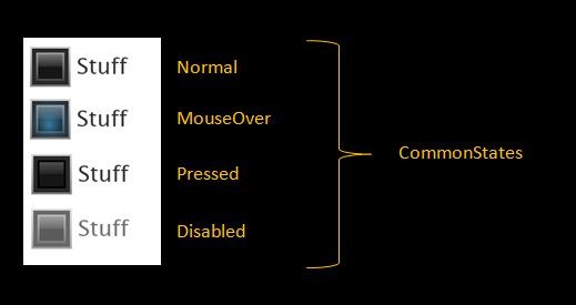
- The Normal state does not define a Storyboard. This is because the Normal state looks the same as the “base” look of the ControlTemplate,
- The MouseOver state toggles the opacity of the Glow element, giving the illusion of a glow on MouseOver.
- The Pressed state changes the color of the checkbox border, as well as updates the opacity of the highlight border.
- The Disabled state makes the entire control less opaque.
To make this clearer, here’s a screen shot of our skin in these states:
Now, on to the CheckStates:
1: <!-- CheckStates StateGroup-->
2: <vsm:VisualStateGroup x:Name="CheckStates">
3:
4: <!-- Unchecked State -->
5: <vsm:VisualState x:Name="Unchecked"/>
6:
7: <!-- Checked State -->
8: <vsm:VisualState x:Name="Checked">
9: <Storyboard>
10: <DoubleAnimation
11: Storyboard.TargetName="Checkmark"
12: Storyboard.TargetProperty="Opacity"
13: Duration="0" To="1"/>
14: </Storyboard>
15: </vsm:VisualState>
16:
17: <!-- Indeterminate State -->
18: <vsm:VisualState x:Name="Indeterminate">
19: <Storyboard>
20: <DoubleAnimation
21: Storyboard.TargetName="IndeterminateRect"
22: Storyboard.TargetProperty="Opacity"
23: Duration="0" To="1"/>
24: </Storyboard>
25: </vsm:VisualState>
26:
27: </vsm:VisualStateGroup>
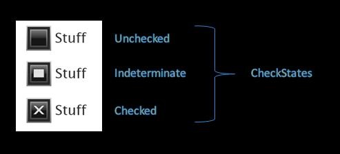
We populate the CheckStates state group with three VisualStates:
- The Unchecked state, like the Normal state, does not define a Storyboard. It will look the same as “base” look of the ControlTemplate,
- The Checked state toggles the opacity of the Checkmark graphic.
- The Indeterminate state toggles the opacity of the Indeterminate rectangle.
Here’s a screen shot of the CheckBox in the different Check states.
Sweet!
So, we’ve created all the VisualStates for our CheckBox. What else do we need to do?
Well, today, the control code is responsible for initiating state changes using VisualStateManager. (You’ll learn about how the control code does this next time.) In the ControlTemplate, then, you don’t need to do anything else to have the VisualStates be detected & used.
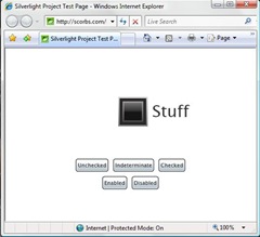
To see our newly skinned CheckBox in action, run the app here.
Adding VisualTransitions
When you ran the CheckBox viewer application, you probably noticed that all the VisualStates “snapped” into place. That makes for a clunky user experience.
What we want is for each visual change to happen gradually. In Silverlight, you accomplish this by adding VisualTransitions to the different VisualStateGroups.
Adding a Default VisualTransition for a StateGroup
Let’s say we want all the states transition in CommonStates to take .5 seconds and all the state transitions in CheckStates to take .2 seconds. You get this effect by including a default VisualTransition in each state group.
1: <!-- VisualStateManager-->
2: <vsm:VisualStateManager.VisualStateGroups>
3:
4: <!-- CommonStates StateGroup-->
5: <vsm:VisualStateGroup x:Name="CommonStates">
6:
7: <!-- CommonStates Transitions-->
8: <vsm:VisualStateGroup.Transitions>
9: <vsm:VisualTransition GeneratedDuration="0:0:.5" />
10: </vsm:VisualStateGroup.Transitions>
11:
12: ...
13:
14: </vsm:VisualStateGroup>
15:
16: <!-- CheckStates StateGroup-->
17: <vsm:VisualStateGroup x:Name="CheckStates">
18:
19: <!-- CheckStates Transitions-->
20: <vsm:VisualStateGroup.Transitions>
21: <vsm:VisualTransition GeneratedDuration="0:0:.2" />
22: </vsm:VisualStateGroup.Transitions>
23:
24: ...
25:
26: </vsm:VisualStateGroup>
27:
28: </vsm:VisualStateManager.VisualStateGroups>
As shown in the above XAML, you create a default VisualTransition by adding a VisualTransition to the VisualStateGroups.Transitions property. VisualTransitions…
- have a Duration property
- This indicates to VisualStateManager how long you want the transitions to take.
VisualStateManager, in turn, creates linear transition animations for all properties animated with…
- ColorAnimation/ColorAnimationUsingKeyFrames
- PointAnimation/PointAnimationUsingKeyFrames
- DoubleAnimation/DoubleAnimationusingKeyFrames
… in the from and to state storyboards.
What do I mean by this? Let’s look at an example.
What happens in the transition from Normal to MouseOver? VisualStateManager detects that the MouseOver state storyboard animates the Glow element’s Opacity property, but the Normal state does not. It creates a linear DoubleAnimation for the Glow element’s Opacity going from 0 (the value in the Normal state) to 1 (the value in the MouseOver state).
VisualStateManager does this for each state transition: it examines the properties animated in the initial and final state and creates the appropriate transition between the two values. The result is a control look with gradual transitions created with minimal XAML.
See it for yourself: run our viewer app again.
Creating VisualTransitions for Specific State Changes
Adding a default VisualTransition helped the feel of our CheckBox a lot. But the transitions are still a bit awkward for some of the state changes.
For instance, you may want the visuals to snap when you go from the MouseOver to the Pressed state. This would help the “click” to feel more for immediate to the user. You do this by adding a transition and specifying the from and to state:
1: <!-- CommonStates Transitions-->
2: <vsm:VisualStateGroup.Transitions>
3: <vsm:VisualTransition GeneratedDuration="0:0:.5" />
4: <vsm:VisualTransition GeneratedDuration="0:0:0.8" To="MouseOver"/>
5: <vsm:VisualTransition GeneratedDuration="0:0:0.2" From="Pressed"/>
6: <vsm:VisualTransition GeneratedDuration="0" From="MouseOver" To="Pressed"/>
7: </vsm:VisualStateGroup.Transitions>
As you can see, VisualTransitions also have…
- From & To properties.
- These properties hold the name of a particular state
- They help VSM pick the right transition for a state change
By inspecting these properties, VisualStateManager chooses the most specific transition from the VisualStateGroup.Transitions for a particular state change.
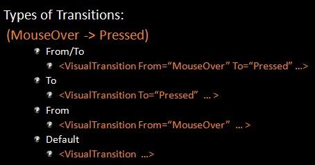
What happens when our CheckBox goes from MouseOver to Pressed? VisualStateManager looks first for a From=”MouseOver”/To=”Pressed transition. If it doesn’t find it, VSM then searches for a To=”Pressed” transition, and then, if necessary, a From=”MouseOver” transition. Finally, if it still hasn’t found a transition, VSM will use the default transition for that state group. If there was no default transition defined, it will use a zero length duration.
By giving specific VisualTransition for certain state changes, our CheckBox now looks and feels exactly the way we want!
Give the final app a try here. You can also grab the final XAML for the CheckBox skin as well as the full app sample code.
Next time
Okay, so that’s the basics of how to use VisualStateManager to reskin an existing control.
Next time, you’ll see how to build up a custom control from scratch that uses the Parts & States Model. You’ll also learn about how to use Parts in the template and how to add more complex transitions.
Excellent!
Second that! Nice post. I’ve always felt this kind of explicit control state model was missing from Wpf, and it’s so easy!
It’s hard to critic the pre-release doco, I just hope it gives the full picture as this walkthrough does.
Eg. Control contract, and sample ControlTemplate markup (which shows the VisualStateManager).
I often find theres to much description with Wpf doco, and not enough code markup.
The VisualState Manager just makes me all warm and fuzzy inside. It’s one of these features I lurve a lot.
–
Scott Barnes
Product Manager (WPF/Silverlight)
Microsoft.
would be nice to have a ? question mark as the indeterminate state marker. And check mark as the checkmark state instead of an X
Good stuff!!
This is a great tutorial but what about explaining how to create these states, transitions via Blend?
I have been really struggling to get the developer/designer workflow. I think VSM & PARTs model is key for this.
This is going to be really key to great extendable controls.
As a side note, is it possible to dynamically load all of this? So a designer can edit an external xaml file outside of the XAP?
I’ve just been sitting around waiting for something to happen.,
Hi Karen,
Part 2 is missing?
Thanks everyone who let me know the post content was missing!
Looks like a great tutorial.. although unfortunately all the images and downloads seem to be missing. Are you able to put them back up again?
Thanks for the heads up! My site went down a couple weeks ago, and I guess it was and incomplete reload. Fixed!
Pingback:Parts & States Model with VisualStateManager (Part 3 of 4) | karen corby's fabulous blog
Pingback:Parts & States Model with VisualStateManager (Part 1 of 4) | karen corby's fabulous blog